This project was developed as part of my master’s capstone at Carnegie Mellon University, in the Educational Technology and Applied Learning Science (METALS) program under the Human-Computer Interaction Institute (HCII). Partnering with the edtech company Schoolified, our goal was to apply educational design principles to a real-world product challenge and propose impactful learning solutions. As the Lead Designer, I collaborated closely with a cross-functional team of PM, researcher, and engineer. I was responsible for setting the design direction, driving decision-making, and translating research insights into actionable design concepts. Our final proposal focused on integrating Social Emotional Learning (SEL) into Schoolified’s teacher platform—a direction shaped by user research and iterative prototyping with real educators.

Problem
Remote teaching presents novel challenges (e.g. student social/emotional status is difficult to monitor, maintaining student attention requires additional strategies & effort) for educators who do not have the benefit of physical presence to guide their students. Many products already exist to address these challenges, yet none provide comprehensive solutions, and they are frequently cumbersome to operate. The purpose of this project is to identify clear areas where Schoolified’s classroom management suite can be improved to address these challenges, making it easy and convenient for educators to fulfill their needs and accomplish their goals.
UX Outcomes
To translate the SEL model into actionable classroom tools, we extended Schoolified’s existing design system to create two user-centered interface directions:
Classroom Interface for Real-Time Awareness
Designed a live classroom screen that helps teachers monitor the affective states of all students during instruction. Teachers can switch between a class-wide overview and focused views for individual students, enabling more responsive, emotionally-aware teaching.Teacher Dashboard for Ongoing Insights
Introduced an SEL-informed dashboard concept that allows teachers to track patterns in student emotions over time. This dashboard prototype was built from scratch—Schoolified had no prior dashboard—providing an opportunity to shape data visualization, interaction flow, and UX from the ground up.
These solutions aimed to reduce cognitive load, support classroom decision-making, and build emotional visibility into teachers’ daily workflows—all while staying aligned with Schoolified’s visual and technical design foundations.

Process
This project followed a research-to-prototype process across two semesters:
Scoping: Kicked off with client alignment and project scoping to define direction and constraints.
Research & Synthesis: Conducted competitive analysis, and 13 teacher interviews to identify pain points and opportunities around emotional awareness in remote learning. Insights were synthesized into actionable themes.
Ideation: Generated learning interaction concepts that leveraged affective data, supported teacher workflows, and aligned with the client’s platform structure. Narrowed direction through stakeholder reviews.
Prototyping & Testing: Developed iterative prototypes, including:
A Classroom View for tracking real-time student states
A Teacher Dashboard for trend insights and reflection
Prototypes were tested with teachers to refine clarity, usability, and alignment with real-life teaching practices.

Competitive Analysis
Following our kickoff with Schoolified, we mapped the competitive landscape across seven core areas relevant to their platform: Lesson Creation, Synchronous/Asynchronous Learning, Lesson Marketplace, Analytics Dashboards, Enrichment Activities, and Parent-Teacher Interaction.

Interview
We conducted 13 interviews with elementary school teachers (mainly grades 4–6), focusing on how they create lessons, use textbooks, and adapt to remote teaching. This method helped us understand their instructional habits, content preferences, and the evolving challenges they face in digital and hybrid classrooms.
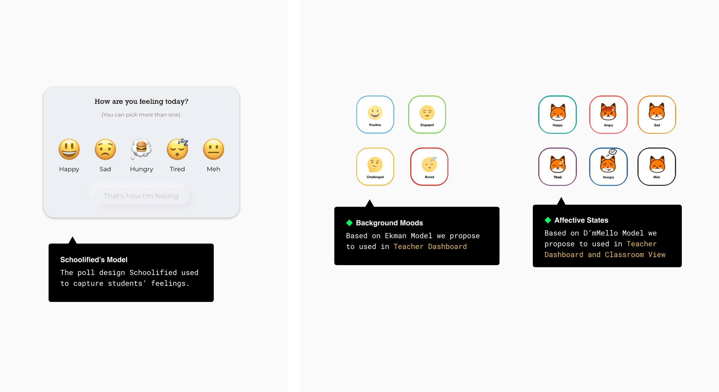
Implementing SEL into design
To inform our design, we grounded our solution in two affective models that reflect both long-term and momentary emotional experiences. The Background Mood model (inspired by Ekman's framework) captures emotions that persist for hours or days, such as frustration or disengagement. This model was used to inform the Teacher Dashboard, allowing teachers to track trends and patterns over time through poll-based check-ins. In parallel, the Affective States model (based on D’Mello’s work) focuses on short-term emotional shifts during learning activities—such as confusion or curiosity—and was applied to both the Teacher Dashboard and Classroom View, with the aim of supporting real-time understanding through passive data collection.
Together, these models helped us design interactions that make emotional insights more visible and actionable for teachers, ultimately supporting more empathetic and responsive instruction.
Teacher Dashboard
Design Goals
Gather historical data for both background moods and affective emotional states to help teachers adapt their teaching.
Design Elements
In order to visualize the in-class data from the gaze tracking and the facial emotion recognition and also collect the historical data for both background moods and affective emotional states to help teachers adapt their teaching. We used various data visualizations in our teacher’s dashboard.
Iterations
Throughout multiple rounds of teacher feedback, we iteratively refined the dashboard interface to better align with teachers’ mental models and cognitive load. Each iteration was shaped by real reactions from educators, with a focus on usability, data interpretation, and visual clarity.
2nd Iteration – Exploring Actionability & Insights
Teachers appreciated the slide-level insights, especially knowing which slide students struggled with most. Many expressed a desire for more actionable summaries, like which activities students enjoyed or disliked. Some also noted that aggregated mood data was less useful in real-time adaptation.
→ Design decision: We emphasized per-slide emotional tracking and removed high-level mood summaries that didn’t support actionable teaching decisions.3rd Iteration – Information Density & Visualization Feedback
While teachers liked the interactive hovering effect that revealed student reactions on slides, they found the dashboard visually dense and overwhelming. Donut/pie charts were flagged as potentially misleading, and alternative visual formats were suggested.
→ Design decision: We reduced visual clutter, replaced pie charts with more intuitive bar graphs, and adjusted layout hierarchy to surface key insights first.4th Iteration – Refining Visual Language & Accessibility
Teachers found the color palette too saturated, making it difficult to interpret meaning quickly. Line charts also appeared too jagged, triggering a negative emotional response. Despite that, the slide-specific confusion tracking was consistently well received.
→ Design decision: We simplified the color scheme, introduced scatterplots for smoother emotional trends, and fine-tuned tooltip interactions for easier interpretation.
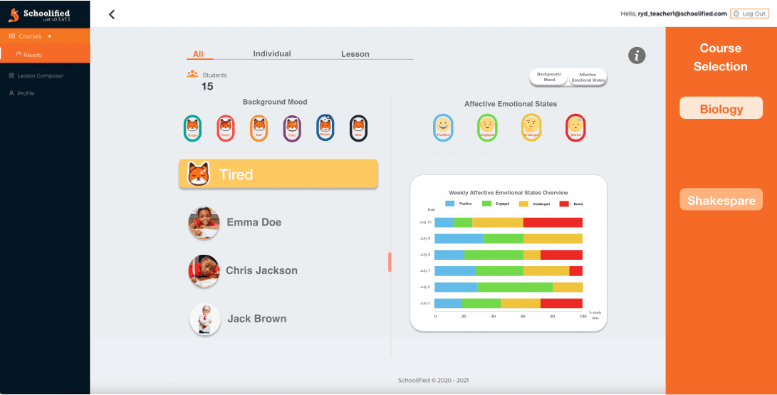
Background Mood Overviews
We unified the color scheme with the classroom interfaces design. Instead of putting a colorful graph of background mood on the landing page, we made a scroll bar to help teachers see the student rankings with different moods by clicking each background mood tab (shown on the top). Also, teachers can see more daily/weekly details about student mood rankings by clicking the toggle.

Affective Emotional States Overview
The biggest change for our affective emotional states overview page was the data visualization on the left side. We changed the previous line chart into a scatterplot based on the feedback we got from the teachers’ interviews. Teachers said they really like this page because it’s clean and intuitive enough to get the information they want.
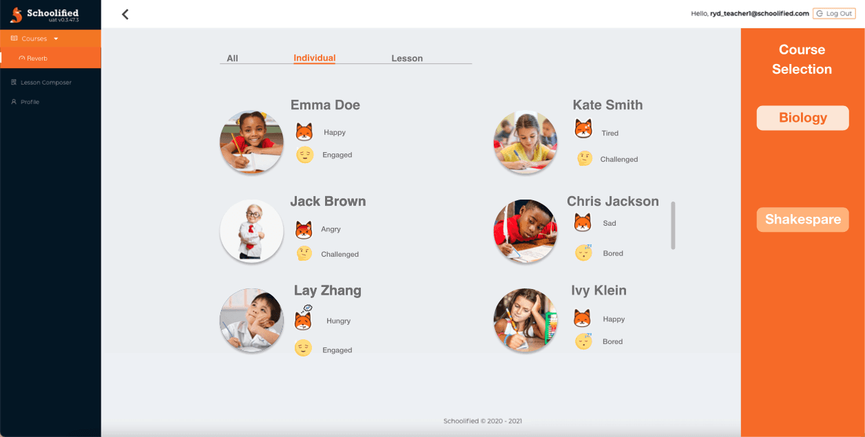
Individual Student Interfaces
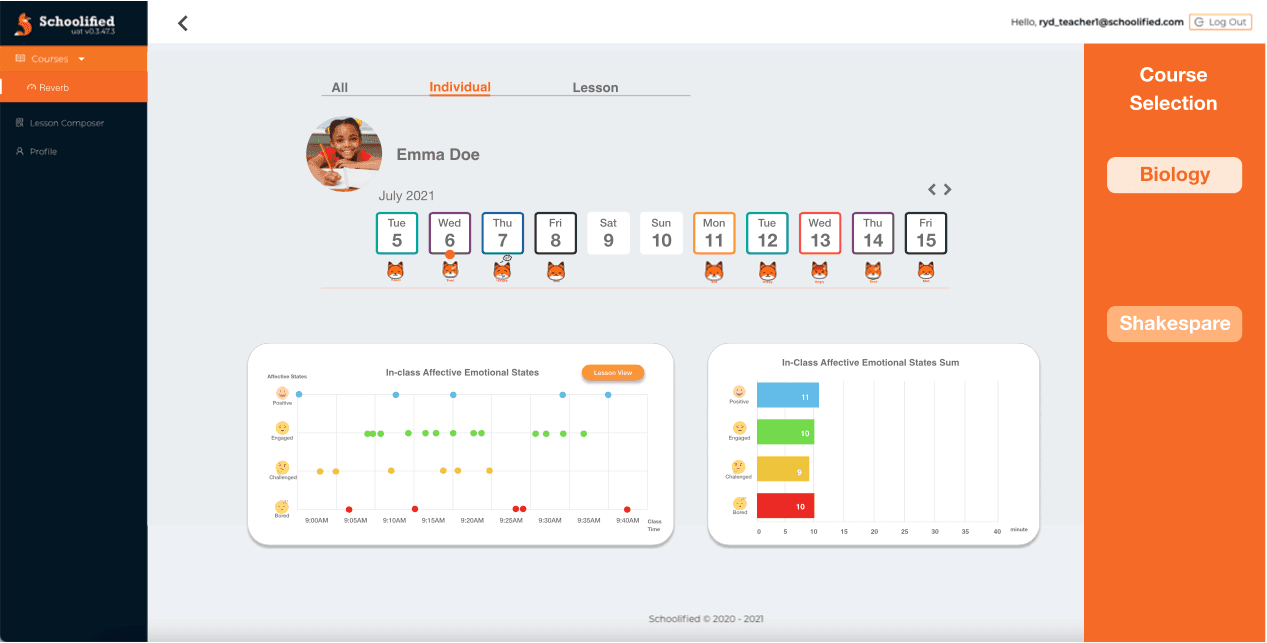
For the individual student page, we kept the same design from last iteration (shown on the top image) with both background mood and affective emotional states for each student. And we put student’s daily background mood below each corresponding calendar day. The affective emotional states visualization design follows the same design pattern as the affective emotional states overview on the previous page.
Lesson View Interfaces
Teachers can easily understand students’ affective emotional states for each slide by looking at the lesson view page. During the teachers’ interviews, this page has the highest praise among all the interfaces. Teachers said they would learn how to adapt their teaching instructions with the help of the information shown on this page.
Classroom View
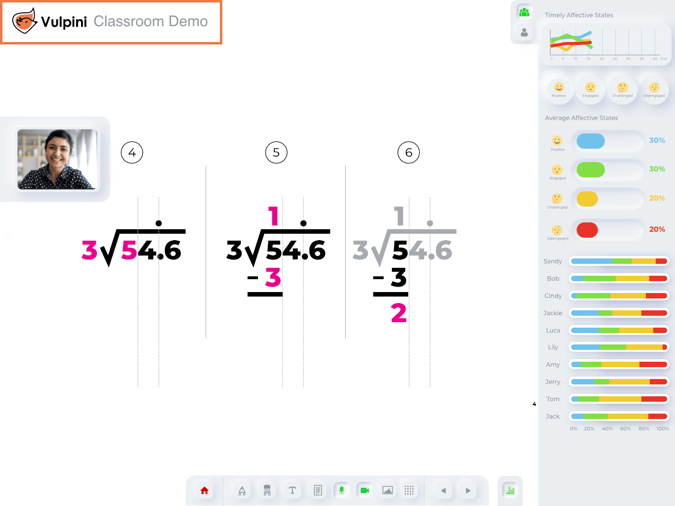

Design Goals
Help teachers navigate students’ affective states during live classrooms
Design Elements
General Tracking: General tracking is divided into “Timely Affective States” and “Average Affective States”. Based on our observation with teachers, Timely Affective States is the most useful section to track students’ emotional states to see the trend. As for Average Affective States, they would rather see the report of their teaching after class.
Individual Tracking: After teachers find a student is very confused or very disengaged, they can enter their indivual panel and enter drop in mode with that students. However, many teachers indicated that a better way for them to check in with a student is to see their faces.
Iteration
For the classroom-facing interface, our goal was to support real-time decision-making without overwhelming teachers. Feedback helped us adjust how affective information was surfaced—shifting from dense summaries to more immediate, glanceable cues.
2nd Iteration – Rethinking Information Priorities
Teachers consistently noted they prioritized negative affective states over positive ones, especially in high-cognitive load teaching environments. Many found percentages, averages, or static summaries less helpful in the moment, and preferred focusing on outliers or mood spikes over time.
→ Design decision: We simplified the interface by surfacing only negative or quickly changing moods, deprioritized average stats, and enabled temporal filtering (e.g. last 10 minutes) to help teachers spot struggling students fast.3rd Iteration – Supporting Real-Time Responsiveness
Teachers responded well to trend indicators, allowing them to act on rising confusion or disengagement. Listing students under specific mood states was also praised as actionable. However, questions were raised about hierarchy and sorting (e.g. level of confusion).
→ Design decision: We added trend arrows to show mood trajectories, and included mood-based student lists with clearer sorting logic to help teachers act without overthinking.
Impact
The project introduced an innovative approach to integrating Social Emotional Learning (SEL) into classroom workflows. By designing a real-time classroom interface and a new teacher dashboard, our solution empowered educators to recognize and respond to students’ affective states—enhancing engagement, emotional safety, and classroom adaptability. The final prototypes laid a foundation for further development with Schoolified's internal team.