Role
Product Designer
Client
Carnegie Learning
Duration
8 Weeks
Background
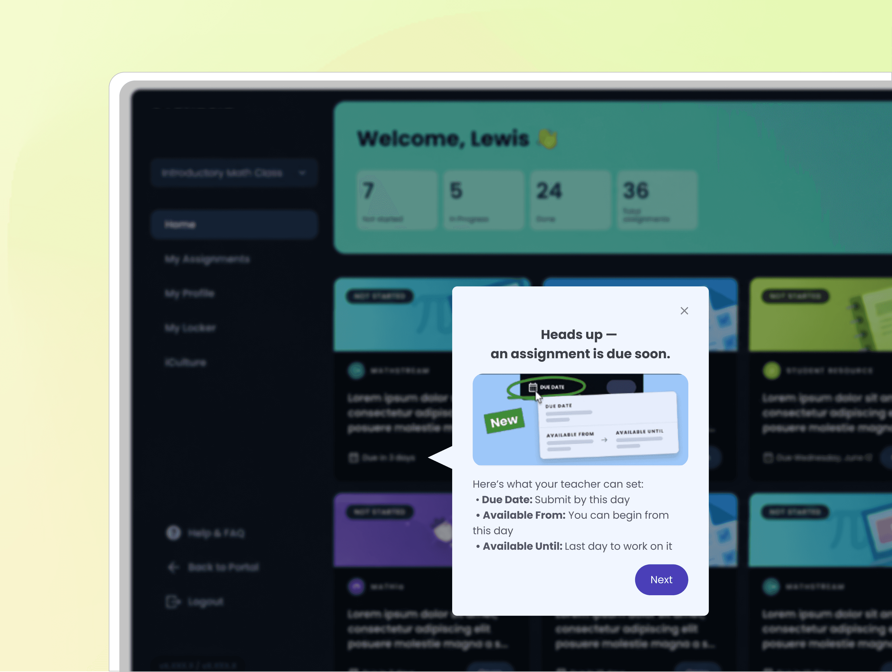
As Pendo became a primary channel for onboarding, announcements, and in-product education, messaging creation was largely owned by PMs across two product platforms, without a unified design workflow or system oversight.
Over time, this led to more than 150+ independently created guides with inconsistent structure, visual treatment, and interaction patterns.
Why This Became a Problem
The lack of a shared design framework created three systemic issues:
Fragmented user experience across products: onboarding and announcements felt unrelated between platforms, weakening trust in product guidance.
No design governance in messaging creation: PMs relied on Pendo’s built-in editor, resulting in uncontrolled variation in layout and tone.
Scalability risk as adoption increased: without a unified system, each new guide increased design debt rather than improving consistency.
This was no longer a UI consistency issue, but a scaling workflow problem between product, design, and PM ownership.
My Approach
I led a system-level initiative to close the gap between product messaging needs and design system constraints.
1. Audit and use-case grouping
I reviewed 150+ existing in-product messages (Pendo Guides) across two platforms and identified usage patterns in onboarding, announcements, and feature education, then grouped them into clear use cases.
2. System alignment and component mapping
I mapped existing product design system components into Pendo’s constraints and defined a reusable guide structure, including layouts, buttons, typography, icons, and color rules.
3. Workflow governance and enablement
I turned the system into lightweight guidelines and design specs so PMs could create consistent guides without design support.
I Validated the system through design reviews and iterative testing across real onboarding scenarios.
UX Outcomes
Consolidated 150+ inconsistent in-product messages into a unified system across two platforms
Defined reusable guide structures aligned with the product design system
Enabled PMs to independently create consistent guides without design support
Improved consistency across onboarding and announcement experiences
Reduced future design and messaging fragmentation

Process
I audited 150+ in-product guides across two platforms to identify inconsistencies in structure, layout, and messaging patterns.
Based on the audit, I defined reusable guide patterns aligned with the product design system and adapted them to Pendo’s technical constraints.
The final system included reusable layouts, component rules, and lightweight guidelines that enabled PMs and researchers to independently create consistent in-product messaging.

Designing Within Constraints
Pendo’s editor supported basic guide creation, but offered limited flexibility for layout, spacing, and interaction design.
To work within these constraints, I used Figma to define reusable guide structures aligned with our design system while staying compatible with Pendo’s capabilities. Figma also became the primary collaboration space for design reviews, stakeholder feedback, and implementation documentation.
The final system included reusable templates, component guidelines, and detailed specs that supported scalable, self-serve guide creation by non-designers.

Reusable Guide Patterns
Define Main Use Cases
To reduce inconsistency across onboarding and product messaging, I defined a set of reusable guide patterns based on core product communication needs, including onboarding, announcements, and contextual guidance.
Each pattern was designed around different levels of attention, interruption, and user intent, which informed layout structure, content hierarchy, and CTA placement.
Behavioral Rules
To maintain consistency across platforms, all guides followed a shared interaction model:
displayed as overlay-based guidance layers
included a persistent close action
supported anchored or centered positioning
optionally used caret indicators for contextual guidance
These constraints helped standardize interaction behavior while supporting different messaging contexts.

Core Guide Anatomy
Each guide was built from a flexible set of reusable components designed to support different communication needs while maintaining structural consistency.
The system included:
headlines for message prioritization
concise supporting content
primary and secondary actions
optional media for feature explanation
persistent dismissal controls
This structure allowed guides to scale across onboarding, announcements, and contextual workflows without reinventing layouts for each scenario.

Reusable Specifications
To support scalable guide creation, I documented reusable specifications for spacing, padding, typography, button behavior, and radius treatment across teacher and student experiences.
Rather than treating guides as one-off overlays, the system established repeatable rules that enabled PMs and researchers to create new messaging within consistent UX constraints.

Accessibility & UX Writing
To ensure guides remained readable and actionable across platforms, all templates were designed to meet WCAG-compliant contrast requirements while staying aligned with each product’s visual system.
Beyond visual accessibility, I also established lightweight writing guidelines for PMs and researchers, encouraging concise, scannable messaging using plain language and action-oriented copy. This helped maintain clarity and consistency as guide creation scaled beyond the design team.

Platform Adaption
Because guides appear as interruption layers on top of existing workflows, visibility and contrast became critical design considerations across platforms.
The teacher platform used darker outlines and higher contrast treatments to stand out against a light interface, while the student platform adopted lighter modal surfaces and softer tonal contrast to remain readable within a dark UI environment.
These platform-specific themes helped preserve visual consistency while improving focus, readability, and attention hierarchy in different usage contexts.

To support scalable guide creation, I documented reusable typography, color, spacing, and button behaviors aligned with each platform’s design language.
Rather than creating fixed templates, the system established shared rules that allowed PMs and researchers to create new guides with flexibility while maintaining visual consistency across products.
All specifications and reusable components were maintained in a synced Figma library to support long-term scalability and self-serve workflows.
Iterations
Although the guide system aligned with the product’s brand language, early explorations revealed a key onboarding issue: the guides blended into the interface and lacked visibility during important moments.
Because onboarding modals intentionally interrupt the user flow, attention and readability became critical requirements, especially within dense teacher workflows.
To evaluate this, I tested guides directly within real product screens using actual onboarding content rather than isolated component mockups.

Early iterations prioritized brand consistency, but the guides became visually passive against the surrounding UI. I refined:
surface contrast
background treatment
CTA emphasis
visual hierarchy
content density
to improve onboarding visibility while preserving alignment with the platform’s design system.
The final direction balanced accessibility, attention capture, readability, and visual harmony across the product experience.


Impacts
This project established a scalable framework for in-product communication across two platforms.
Rather than treating guides as isolated UI overlays, the system introduced reusable patterns, shared interaction rules, and platform-specific specifications that enabled non-designers to create consistent messaging within defined UX constraints.
The result was a more maintainable onboarding workflow with reduced design debt, clearer communication patterns, and stronger alignment between product operations and user experience.
Reflection
This project reinforced that scalable UX systems depend as much on operational clarity as visual consistency.
Designing for non-designers required defining the right level of flexibility, enough to support different communication needs, but constrained enough to maintain consistency across platforms.
It also shifted my perspective on onboarding design: effective guidance is not about adding more information, but about structuring attention, interruption, and context in ways that support user workflows without overwhelming them.