Role
Product Designer
Client
Originally Schoolified
Duration
2 months

Background
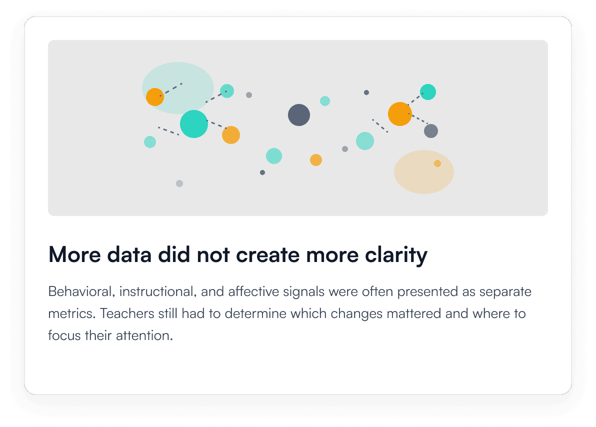
In digital classrooms, teachers lose many of the behavioral and emotional cues they naturally rely on to understand how students are doing. While digital learning platforms can capture increasingly complex signals, simply presenting more data does not necessarily help teachers make better decisions.
The real challenge is how to help teachers quickly understand who might need attention, what changed, and when to act without adding more cognitive load to an already demanding teaching environment.

This project began as a client-sponsored capstone at Carnegie Mellon University, grounded in real research and a real education partner. In 2026, I independently revisited it, using AI throughout the process, to explore how the original research could translate into a more focused and actionable product.
AI shaped this case study in two ways: as a product capability that helps synthesize classroom signals, and as a design partner throughout the process. Its biggest value wasn't speed. It was clarity: surfacing directions worth pursuing, naming trade-offs, and offering critique to support my own decisions. In both cases, AI supported human judgment and never replaced it.
Design Challenges
Design Principles
From data visualization to decision support. I think about why the data exists, what the user should do after seeing it, how to lower the cost of interpreting it, and how it ultimately supports a decision.

User Work Flow: From Signal to Decision

Design Directions: Choosing What Leads
Live Classroom
Three ways to open the Live Classroom screen, each leading with something different: the whole class, the exceptions, or every student at once.

Each direction made a different trade-off. Classroom First matched how a teacher actually scans a room, the whole picture before individual cases, but risked burying real signals in the group view. Exception First surfaced problems fastest, at the cost of leading with an algorithmic severity judgment the system couldn't yet back up. Student Grid kept every student visible, but asked a teacher to hold 24–30 states in view at once.
Teacher Dashboard
Four ways to open the Teacher Dashboard, each anchored to a different question: what happened in today's lesson, which student needs follow-up, what's recurring across sessions, or how participation moved minute by minute.
Lesson Review First reads like a single day's report, it's clear, but doesn't say whether today's dip is new or usual. Student Follow-up First gets straight to who needs attention, at the cost of classroom-level context. Classroom Pattern First waits for evidence across sessions before naming anything a "pattern," trading speed for confidence. Timeline-centered ties every shift back to the minute it happened, good for tracing cause and effect, but adds a layer most reviews don't need.
Design Critique: Testing Against the Principles
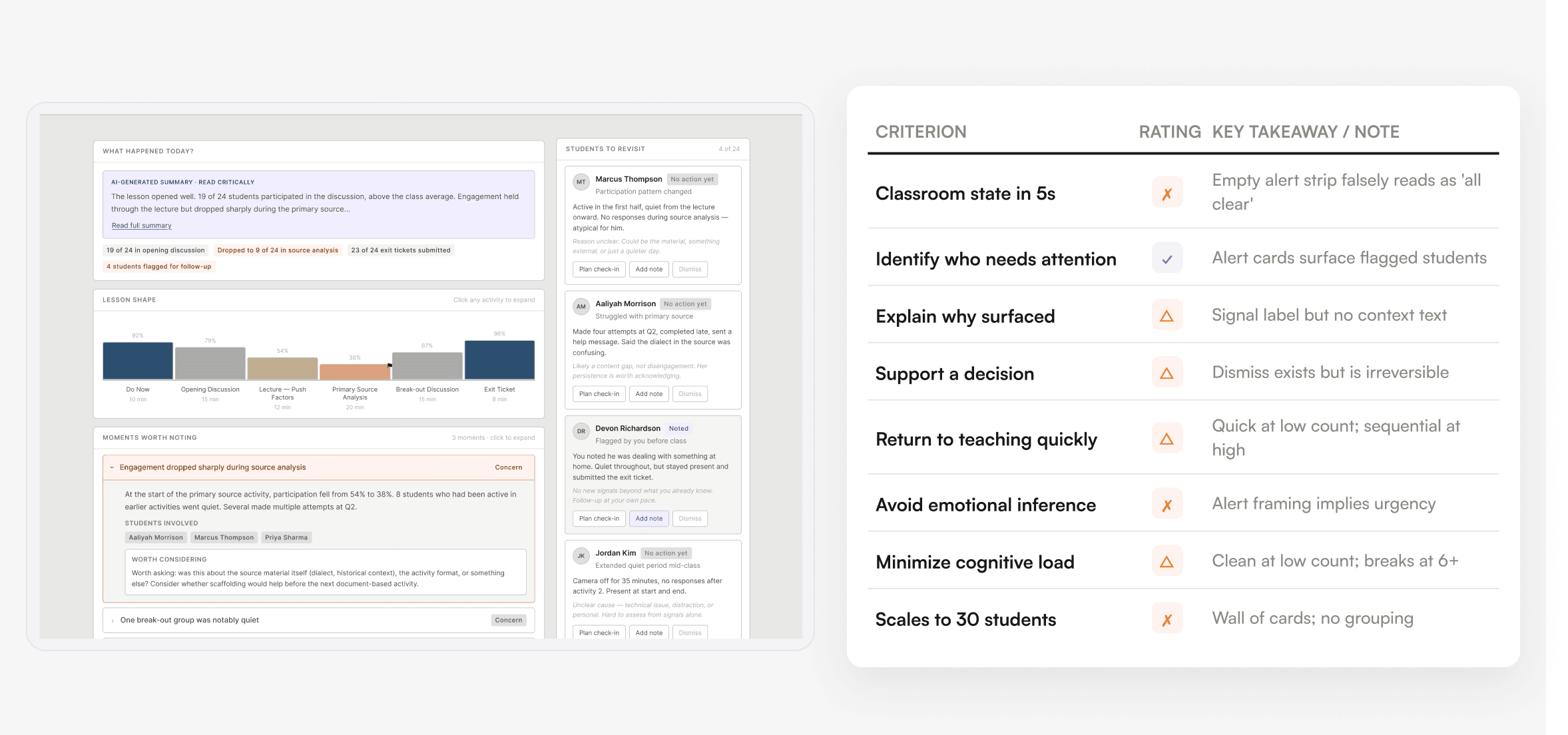
Before committing to a direction, I ran a structured critique with Figma Make across both workflows, three directions for Live Classroom, four for the Teacher Dashboard, scoring all seven against the same eight criteria drawn from the design principles above, from a five-second read of classroom state to whether the structure holds up at thirty students. The goal wasn't to pick a winner by how a screen looked, but to stress-test teacher workflow and decision support before combining what actually worked into the version that shipped.
Live Classroom Design Critique

Teacher Dashboard Design Critique
Final Design
The version that shipped is the hybrid from Testing Against the Principles, not an average of every direction, but a return to the original design principles and product goals once testing showed what each direction actually got right and wrong. From there, getting it into a shippable state was a mix of what Figma Make produced and what I built and adjusted by hand, down to the interaction and edge-case detail.
Live Classroom

Teacher Dashboard

Final words: working with AI
This case study was built in close collaboration with AI from the first framing decision through to the final screens, and it sharpened how I think about working with AI as a designer.
How I should work with AI
Generating data was a real time-saver for a product this workflow- and data-heavy, having AI populate realistic student and lesson content at each stage meant I wasn't hand-building sample data from scratch, though it wasn't hands-off: some of what it generated didn't fit the screen it was meant for, and needed filtering before I could use it.
The stronger use was design critique: giving AI a qualitative lens to test directions against and asking for objective tradeoffs, not just a stylistic opinion. That's the capability I expect to lean on more going forward, not AI generating the design, but AI stress-testing it.