Consistent Onboarding with Pendo Guides
Building scalable onboarding experiences across product, research, and design teams
As our team increasingly relied on Pendo Guides for onboarding, announcements, and user education, the lack of consistent layouts, visuals, and tone became a UX concern. I led an initiative to audit existing guides and build a scalable design framework—including layout templates, visual standards, and writing guidelines—for teachers and students. The outcome benefited PMs, designers, and researchers by aligning product goals with user experience quality.
Problem
01. Inconsistent Guide Experience
Guides were created ad-hoc by PMs without design alignment, resulting in fragmented layouts, unstructured content, and varied interaction patterns. This led to confusion and diminished user trust across platforms.
02. Scattered Onboarding & Messaging
Users encountered different onboarding styles and announcement flows in different product areas, making it hard to follow or trust platform guidance—especially for new users like students and teachers.
03. Unscalable Design Approach
As Pendo adoption grew, the lack of a unified approach became more visible and problematic. We saw a clear opportunity to integrate our design system with Pendo’s native tools to deliver consistent, scalable, and branded experiences.
UX Outcomes
01. Defined clear guide use cases with matching layouts and messaging patterns
02. Created reusable guide components and visual themes in Figma for future scalability
03. Delivered an internal style/writing guideline enabling PMs and researchers to create consistent guides without design support
04. Improved visual hierarchy and accessibility through better contrast, typography, and spacing
05. Reduced design-debt in future onboarding workflows by aligning guides with our design system
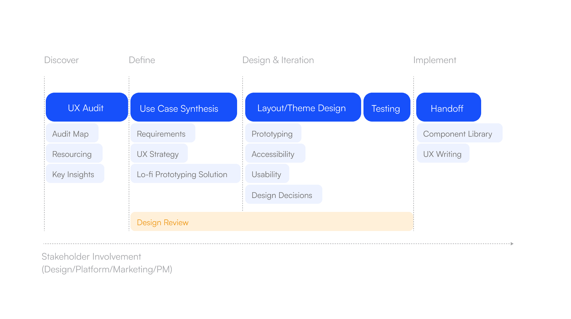
Process
To address fragmented in-app guidance across products, I led the design of a scalable system for Pendo Guides—balancing user experience with self-serve content creation.
Starting with a UX audit, I mapped 150+ existing guides across platforms, uncovering inconsistent patterns and duplicated flows. I then defined core use cases (onboarding, announcements, support), aligned them with appropriate UX patterns, and proposed layout templates that improved hierarchy, clarity, and interaction.
Working within the design system, I introduced theming options tailored to both teacher and student platforms. To support scalability, I created a Guide Style Kit for PMs and researchers—equipping non-designers with clear rules, templates, and writing guidance.
Throughout, I collaborated with PMs and stakeholders in weekly reviews to iterate on visual direction and ensure product alignment.
Constraints
🛠️ Designing Within Pendo's Constraints
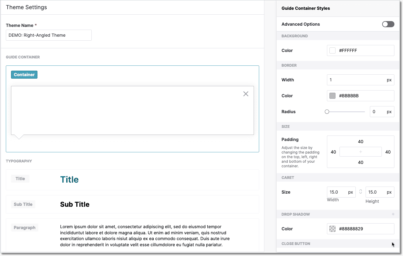
Pendo Designer served as the primary tool for creating in-app guides. While it supports most basic modal and tooltip formats, its customization options remain limited—especially for layout, spacing, and visual hierarchy.
To address this, I used Figma to design guide components within Pendo’s structural boundaries, incorporating our design system to ensure consistency. Figma also served as the main tool for stakeholder communication and design reviews, allowing faster iteration and clearer alignment across teams. Final designs were documented in Figma with detailed specs to support future reuse and self-service by PMs and researchers.
Use Cases
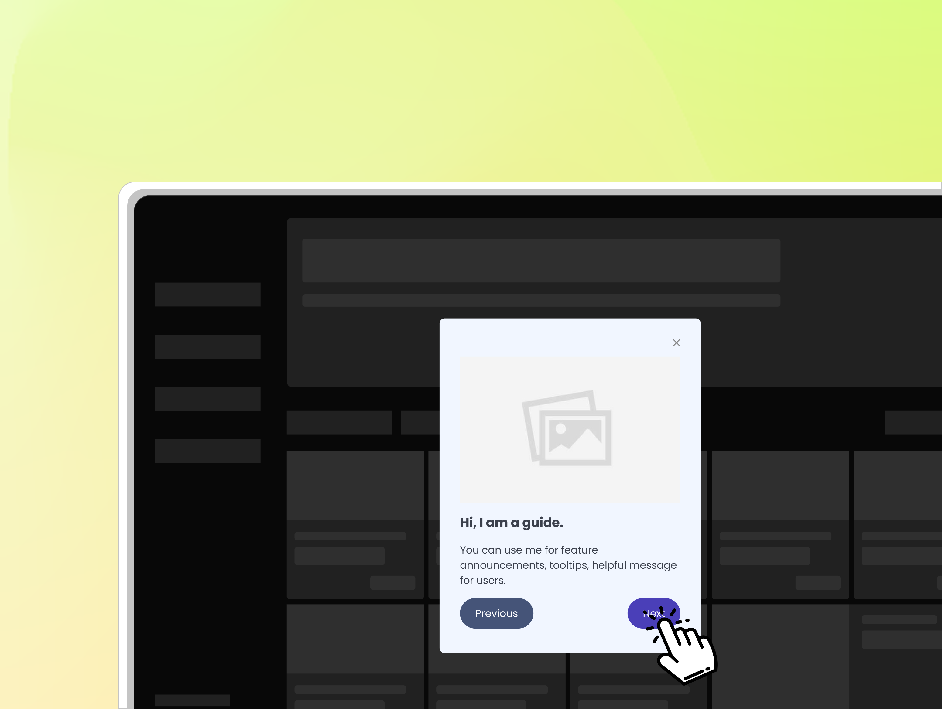
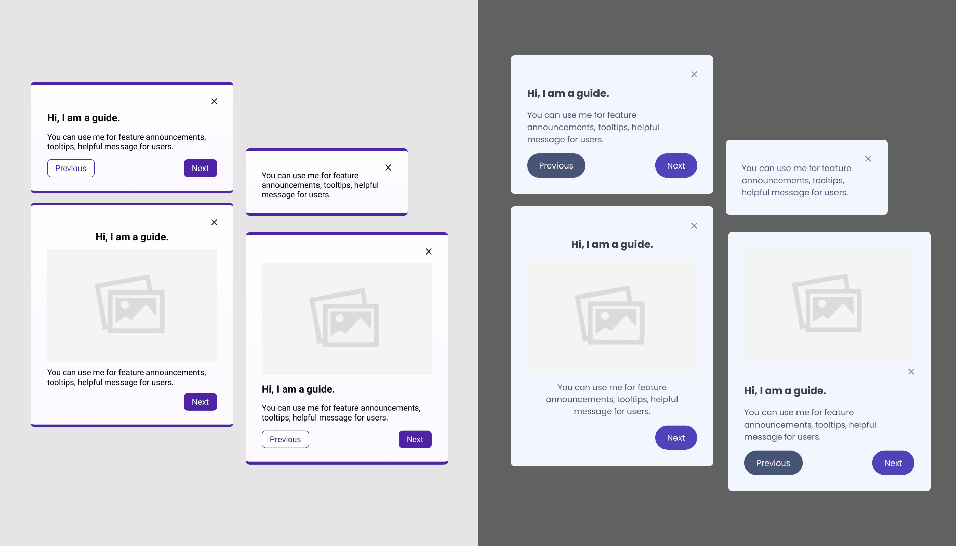
I mapped key use cases—onboarding, announcements, contextual help—to specific guide types (e.g. modal, tooltip, checklist). Each use case had different content flow and attention needs, which informed layout structure and CTA placement.
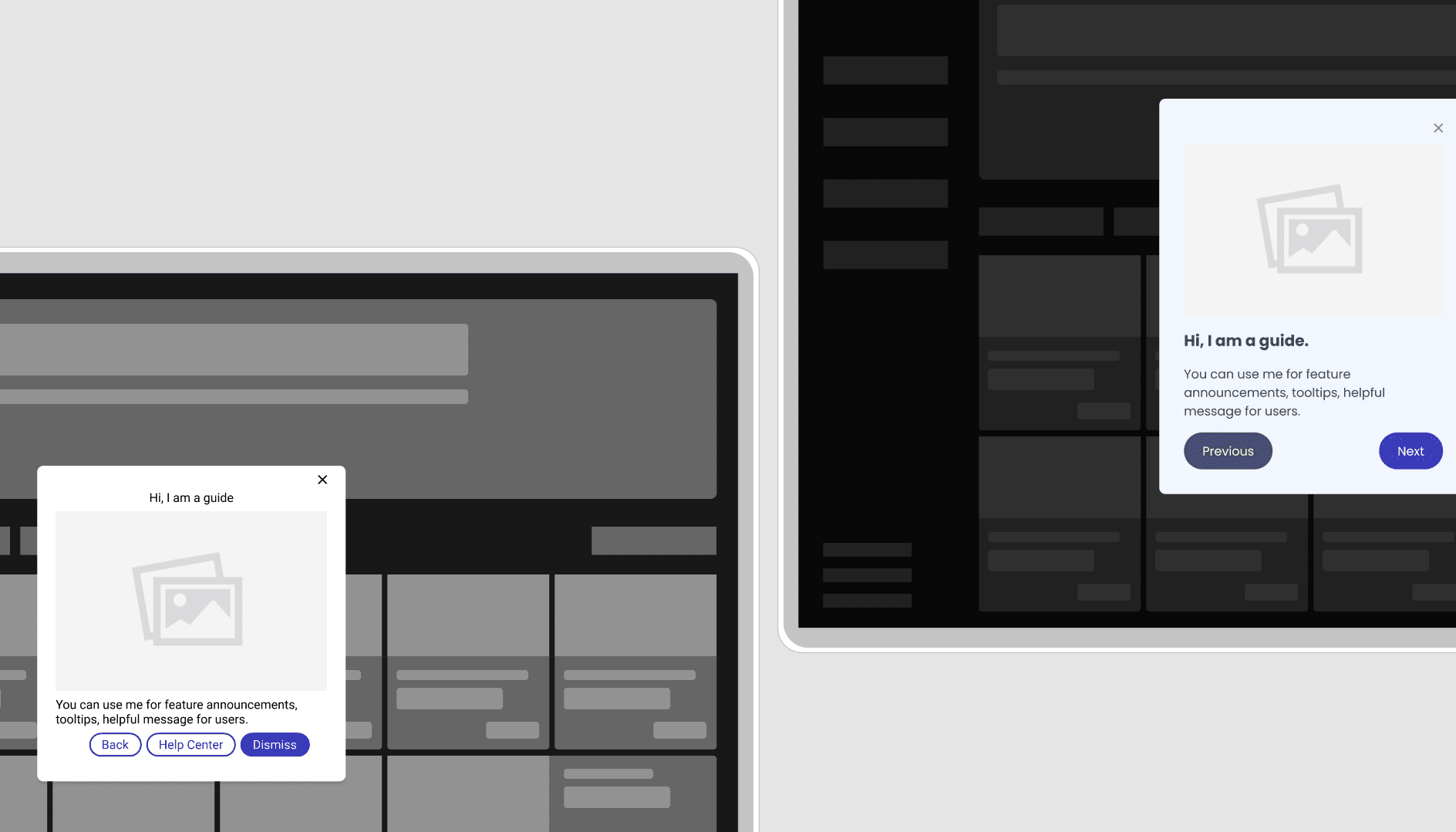
In terms of behavior, Pendo Guides appear as modal overlays that disable all app functionality until the user takes action—such as confirming, dismissing, or completing a task.
Their behavior always follows patterns below:
They include a close button in the top-right corner.
Always appear with a semi-transparent backdrop covering the full interface.
May feature a caret to highlight a specific UI element.
Can be centered on the screen or anchored to a targeted component for contextual relevance.
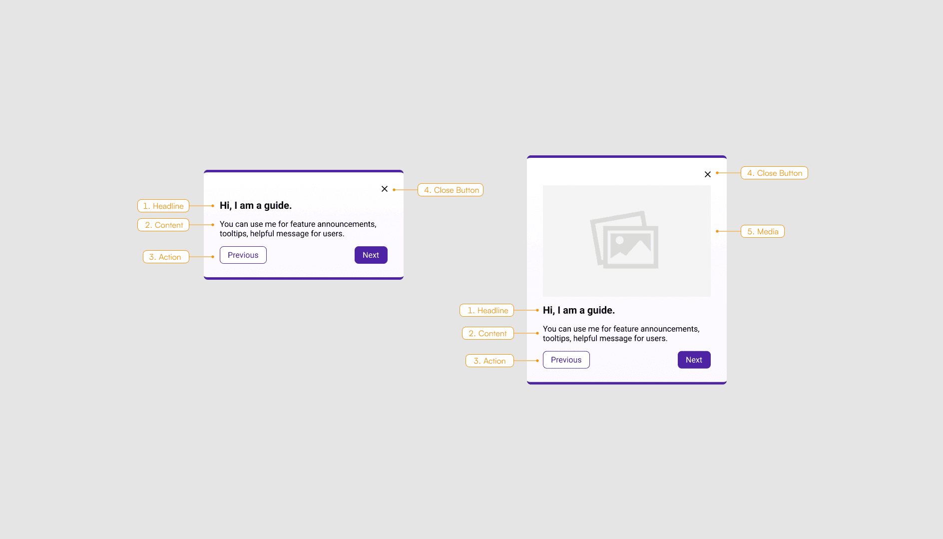
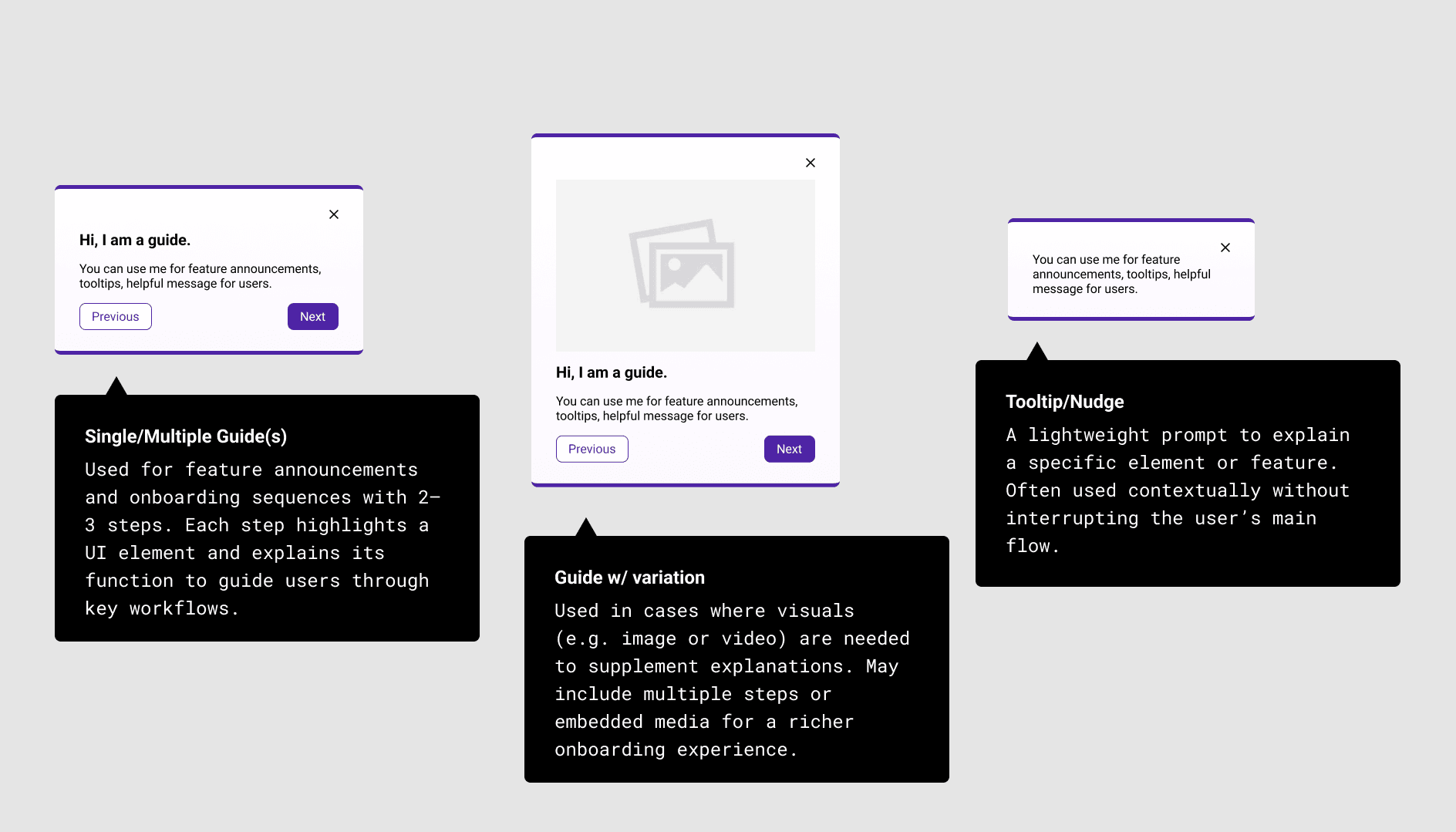
Design Components
A typical modal in the Pendo Guide system consists of the following elements:
Headline – Clearly states the purpose of the modal and guides the user’s attention.
Content – Provides a concise message, instructions, or supporting links.
Actions – Includes at least one primary CTA (e.g., “Next,” “Confirm”) and may include a secondary action such as “Back” or “Cancel.”
Media (Optional) – Visuals such as images or videos can be embedded to clarify the message or demonstrate a feature.
Close Button – Always present in the top-right corner, allowing users to exit the modal. When available, it functions similarly to a cancel action.
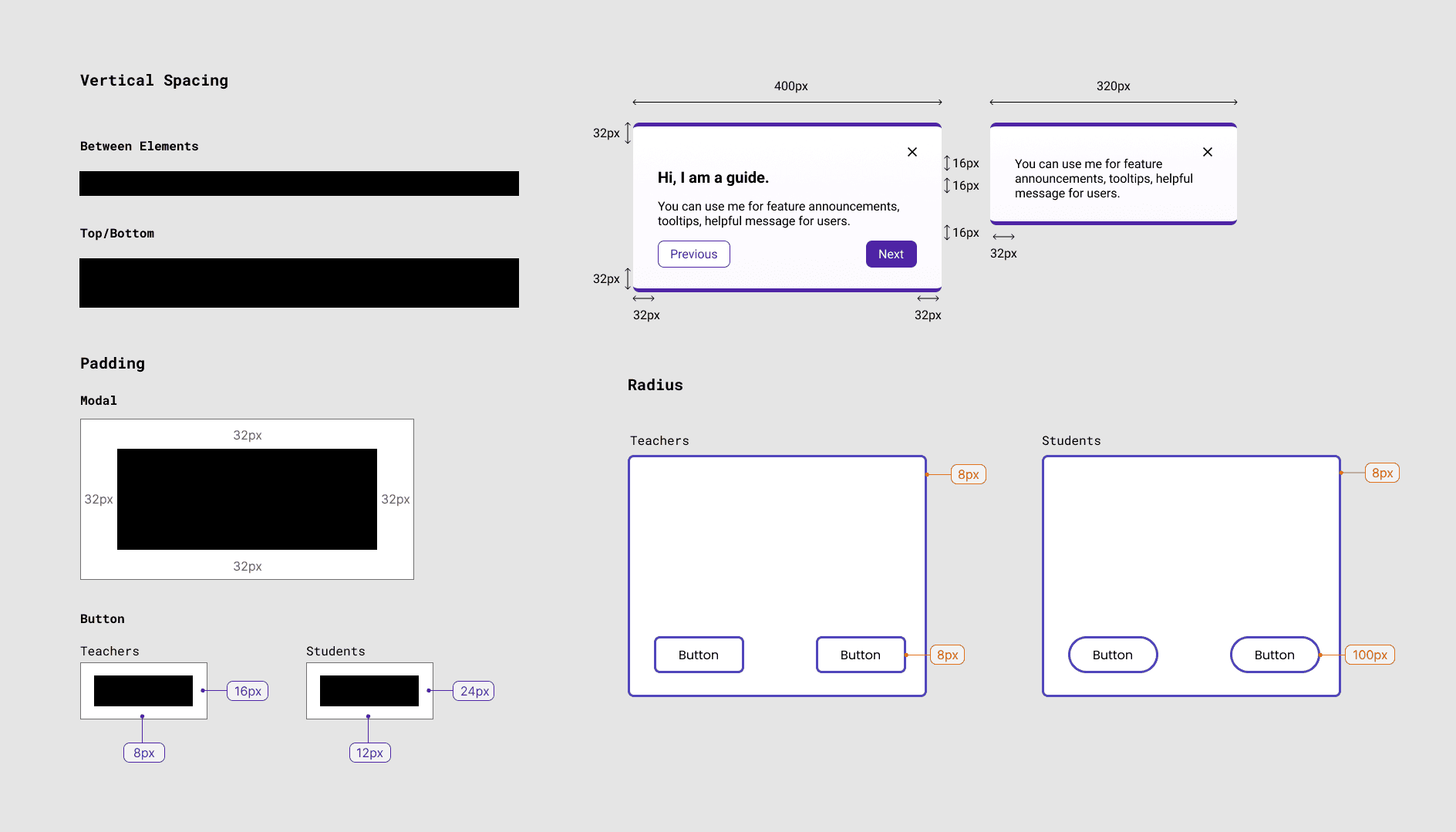
Designing with Scalability in Mind
To ensure visual consistency and usability across platforms, I created a set of reusable and repeatable design specs tailored for Pendo Guides. These specs align with our product’s design system and accommodate the needs of both teacher and student experiences.
From spacing and padding to theming and button radius, each element was documented as part of a lightweight, self-serve system. This allowed cross-functional partners—especially PMs and researchers—to build new guides efficiently, with confidence and alignment.

Accessibility
Pendo Designer enforces a strict WCAG 2.1 AAA color contrast ratio of at least 7:1, particularly for text-background and button-label combinations. To meet this requirement while maintaining brand coherence, I customized guide elements within Figma using our approved design tokens—balancing contrast compliance with visual alignment to the platform.
In parallel, I paid close attention to the UX copy across all guide templates. Since guides are often written by PMs or researchers, I established writing guidelines that emphasized plain language, avoided jargon, and used active voice. The goal was to make each message scannable and actionable, especially for first-time users navigating new features or onboarding flows.
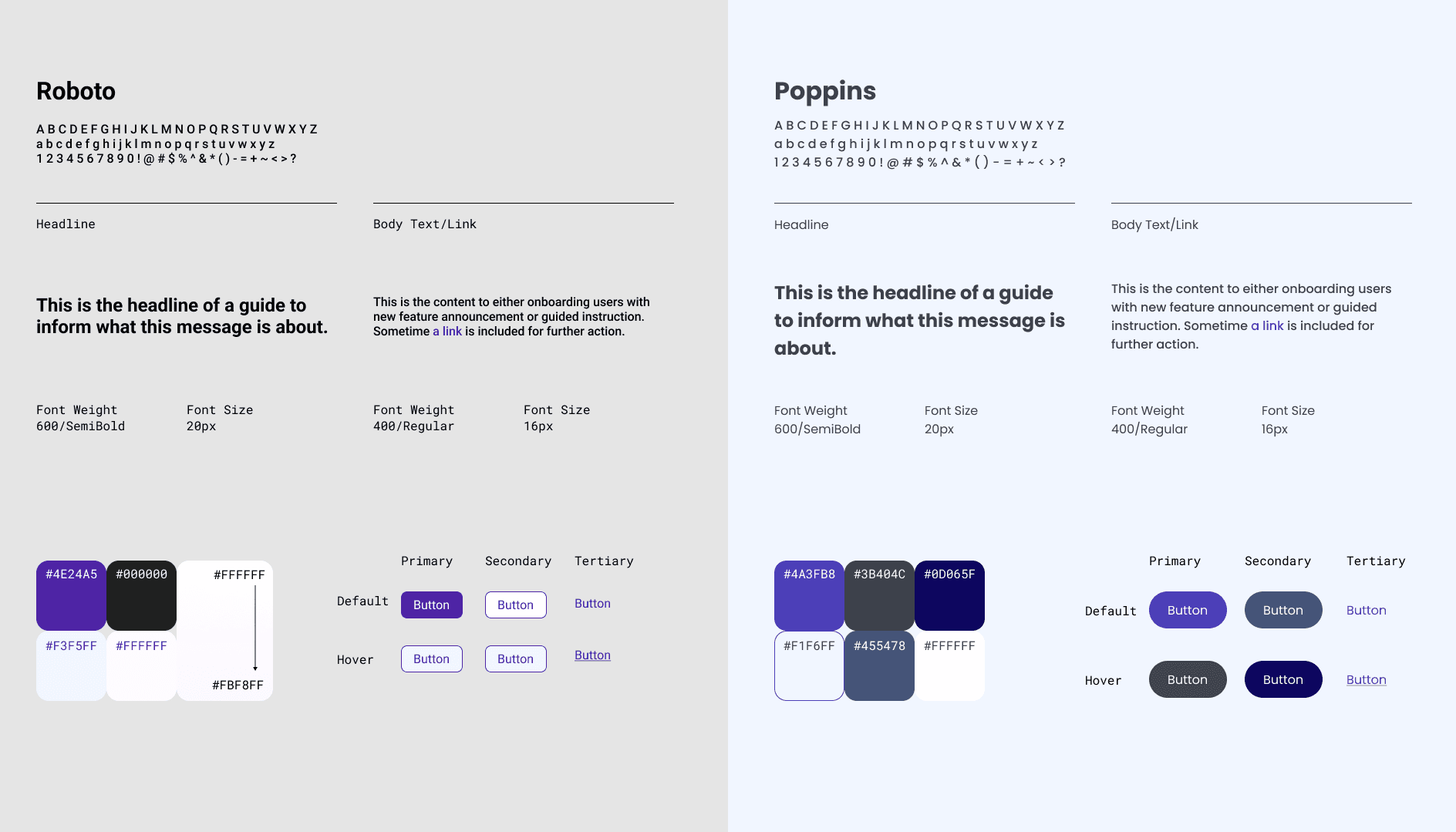
Context-Aware Theming for Different User Platforms
To ensure the modal guides remain visible and actionable, I designed platform-specific themes aligned with existing design systems. The teacher platform—built on a light background—uses darker guide outlines, while the student platform features a dark interface, requiring lighter modal backgrounds to stand out.
This visual differentiation was a deliberate design decision to optimize readability, visual hierarchy, and attention focus within each user context.
Platform-Specific Visual System
As the designer, I bridged existing design systems with cross-platform needs, translating them into scalable tokens and accessible UI behaviors.
Each user group—teachers and students—was supported by a distinct theme system to reflect their usage context and maintain visual consistency with their respective platforms.
On top of layout and component decisions, I documented and aligned the typography, color tokens, and button behaviors based on each platform’s brand system:
Teachers: Roboto font, lighter UI theme, higher contrast buttons for classroom settings
Students: Poppins font, darker UI base, stronger tonal contrasts for clarity
These decisions were built into the component library and spec to ensure scalability and consistent guide creation across platforms.

Iteration
As the lead designer, I created two distinct visual themes aligned with our design system—one for teachers and one for students—to reflect role-specific tone and UI environments.
During internal and cross-functional design reviews with PMs and Marketing, I addressed a key challenge: modals needed to stand out in both light (teacher) and dark (student) platform contexts. While the first iteration followed brand specs, it lacked contrast and failed to capture attention during onboarding.
To solve this, I explored background color strategies, accessibility-tested visual contrast, and introduced subtle gradients via Pendo Designer to enhance guide visibility without breaking consistency. For the student theme, I reversed the tone logic—switching to lighter backgrounds to increase focus within dark UIs.
These refinements balanced usability, brand fidelity, and platform-specific clarity, ultimately improving engagement with onboarding content.

Before
After
Outcome: From Invisible to Intentional
By redesigning the modal themes across teacher and student platforms, I transformed guides from overlooked overlays into purposeful, contextual touchpoints.
On the teacher platform, the new design stands out against a white-dominant interface without breaking visual harmony—enhancing visibility during key moments like onboarding or updates.
On the student platform, I reversed the tone to a lighter, branded look that contrasts effectively against a dark UI—improving focus and readability without overwhelming the experience.
This design system–aligned approach not only improves clarity and consistency, but also empowers PMs and marketers to create effective, on-brand communication—without design bottlenecks.
Impact
📘 A guide system non-designers can use
The final style kit was designed for PMs and researchers—clearly outlining when to use which guide type, how to write effective messages, and how to apply visual styling.
To ensure repeatability, I created a synced Figma reference file with reusable components, so PMs could explore before building and maintain consistency over time.
Designing for clarity, not just consistency.
This system wasn't just a set of rules—it was a toolkit to empower teams, reduce design debt, and elevate the onboarding experience at scale.
What I've learned as a designer
Consistency isn’t just visual—it's organizational.
One of the key challenges in this project was not aligning pixels, but aligning people. When multiple stakeholders (PMs, researchers) are independently creating guides, consistency must be intentionally designed into the system. I learned to create not just templates, but a shared understanding of why consistency matters—especially in education, where trust and clarity are critical.
Simplicity is not minimalism—it's clarity.
Designing onboarding modals taught me that what seems “simple” to a designer isn’t always clear to a first-time user. I had to balance clarity of content, structure of information, and visual focus—ensuring the guide doesn’t overwhelm or under-inform. Simplicity means reducing friction, not just interface.
A scalable design starts with aligned goals.
This project reinforced that design systems are only effective when we define the right constraints early—goals, scope, and audiences. Rather than jumping into visuals, aligning expectations with stakeholders helped me focus the system on self-serve usability, which was the true measure of success.