Redesigning Style Guide for Middle High Math Workspace
Modernizing UI for clarity, consistency, and accessibility
To modernize the outdated math workspace interface, I led a visual redesign focused on typographic hierarchy, component consistency, and accessibility. Given limited resources and a tight timeline, I prioritized changes based on user impact and feasibility—addressing key UX gaps through redesigns while deferring others to future onboarding work. I audited and redefined system tokens (typography, color, buttons, charts) and collaborated closely with PMs and engineers through regular design reviews to ensure development alignment. Although final handoff was delayed due to shifting priorities, the project established a strong foundation for a more systematic, user-centered math platform.

Problem
Outdated visual design hindered student engagement and trust.
Lack of visual hierarchy made it hard for students to focus or follow multi-step tasks.
Accessibility issues (e.g. font size, contrast) negatively impacted students with lower reading confidence.
Limited support for learning flow, with minimal feedback on progress.
Hint system was underutilized due to poor visibility and unclear interaction design.
UX Outcomes
Improved visual hierarchy through updated typography and layout, making key elements easier to find and read.
Enhanced accessibility with better color contrast and scalable text styles.
Established UI consistency across buttons, charts, and interactive elements.
Redesigned hint flow to increase discoverability and encourage timely usage.
Laid foundation for future UI modernization, aligning design and development on scalable guidelines.

Process
1. Prioritization & UX Strategy
Collaborated with PM and design team to align on known issues, constraints, and available resourcing.
→ Defined UX priorities and scoped the redesign strategy by mapping each issue to feasible design outcomes.
2. UI Element Redesign
Conducted redesign of key UI elements (typography, color, button, icon, chart styles) based on feedback from PMs and developers.
→ Held weekly design reviews over 4+ weeks to iterate and align on accessibility and visual clarity.
3. Feature Enhancement: Hint System
Redesigned a key student-facing feature to improve clarity and usability:
Refined the multi-level hint experience by enhancing visual hierarchy, labeling, and interaction flow—making hints more discoverable and encouraging thoughtful use without disrupting mastery logic.
Constraint & Opportunity
Fixed Instructional Content
All instructional and hint content was pre-authored and stored in the backend—uneditable from a UX perspective.
→ Focused on UI presentation, clarity, and hierarchy to improve usability without altering instructional logic.
Development-Locked Layouts
The core workspace structure was already implemented in code.
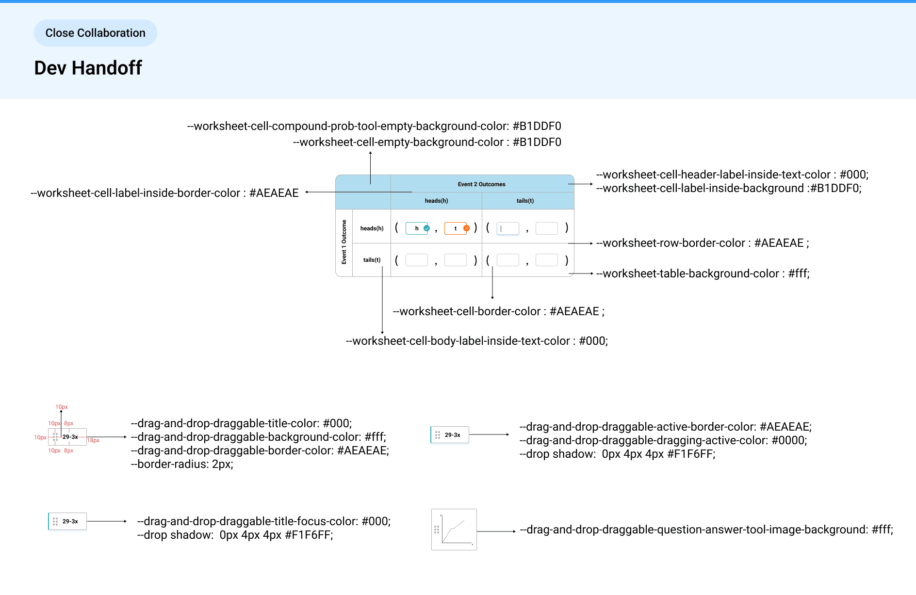
→ Conducted a detailed audit to label each UI element (e.g. prompt, goal, instruction) for better alignment in redesign.Close Dev Collaboration
As the primary designer, I worked closely with engineers to ensure smooth handoff.
→ Included dev-specific terminology (e.g. CSS class names for buttons, text containers) in Figma files for clarity and scalability.
Solution
Typography System
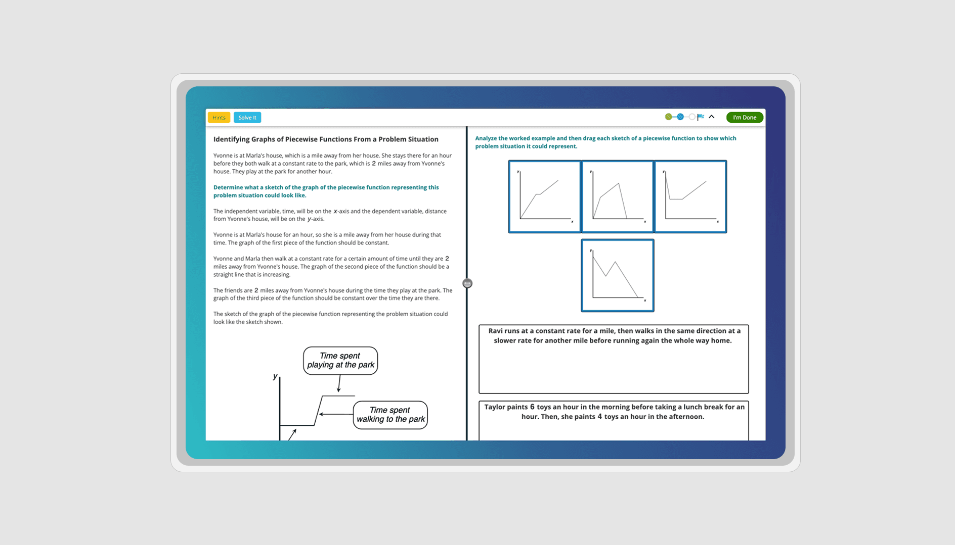
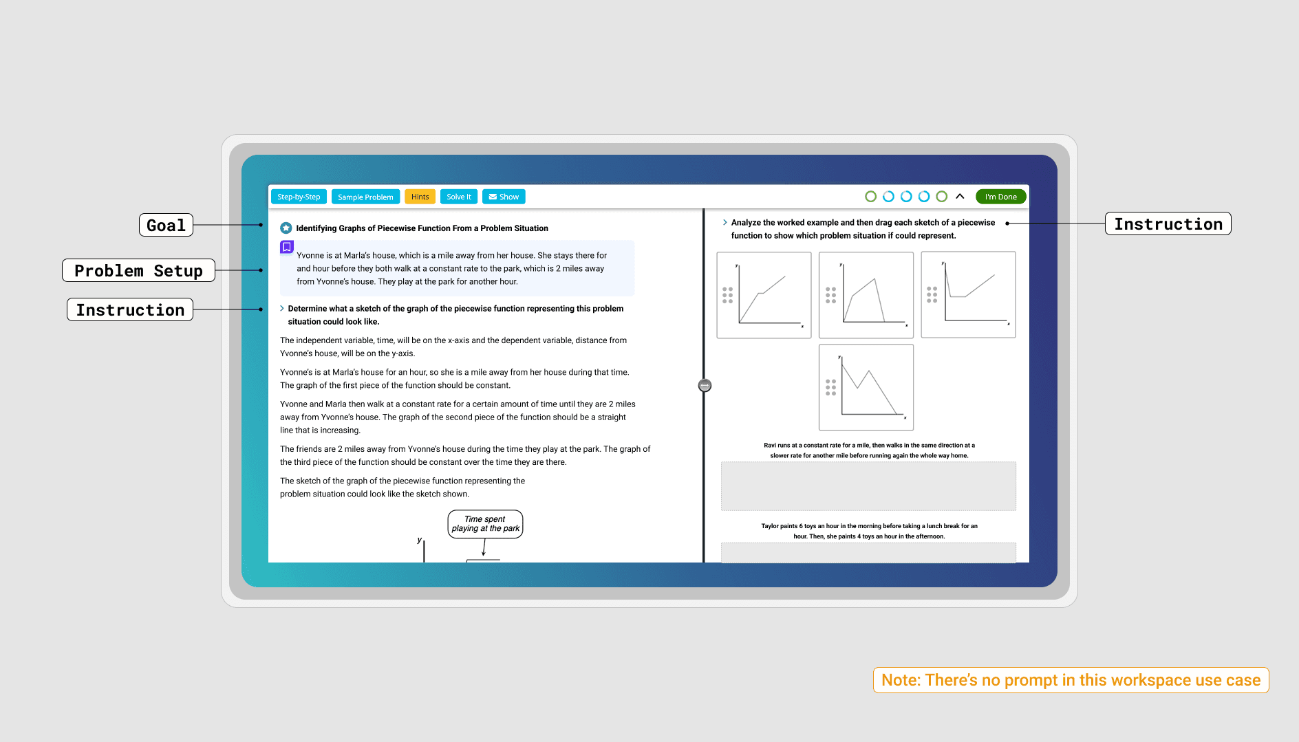
💡 Challenge: Instruction text lacked clarity and hierarchy, making it hard for students to differentiate between problem context, instructions, and goals.
✅ Decision: Defined key text roles (e.g. problem setup, goal, prompt, instruction) and introduced a typographic system using distinct font weights, sizes, and spacing.
🎯 Why it matters: Helped students scan and absorb essential information faster, reducing friction and cognitive load during problem-solving.

Typography Types
Problem Setup
Design Goal: Ensure students can quickly locate and comprehend the problem setup across all workspaces without feeling overwhelmed.
Design Decision: Used a consistent icon and background color to enhance visual distinction while maintaining readability for longer passages.
Goal
Design Goal: Highlight the purpose of the task to help students stay oriented and understand the “why” behind the activity.
Design Decision: Styled as a bold anchor heading paired with an icon, striking a balance between clarity and visual hierarchy.
Prompt
Design Goal: Subtly draw attention to the call-to-action without distracting from more critical content areas like the problem setup or goal.
Design Decision: Kept styling minimal and unobtrusive, close to body text, to maintain a clean and non-intrusive reading flow.
Instruction
Design Goal: Clarify instructional intent and reduce cognitive overload caused by over-reliance on one generic style.
Design Decision: Introduced a distinct text treatment to differentiate instructions from other content types, reinforcing structure while supporting comprehension.
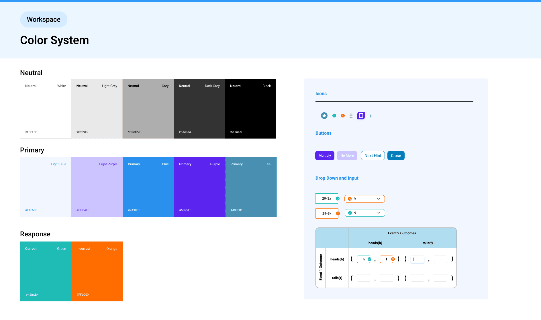
Color
💡 Challenge: The interface relied heavily on grayscale, limiting feedback clarity and failing accessibility standards.
✅ Decision: Refined the color palette using accessible tones from the design system, and defined color states to support visual feedback—such as submission correctness and drag-and-drop interactivity.
🎯 Why it matters: Improved visibility, reinforced action feedback, and created a more intuitive and accessible math workspace.
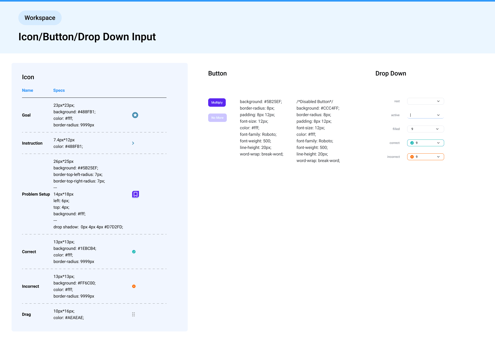
Icon/Button/Drop Down Input
💡 Challenge: Important text areas were underemphasized, and interface elements lacked visual guidance.
✅ Decision: Introduced supporting icons and background colors for better scannability (e.g. pairing icons with problem setup, instruction text). Standardized button styles and enhanced dropdown inputs for table usage.
🎯 Why it matters: Improved readability and interaction cues, increasing students’ willingness to engage with text-based information.
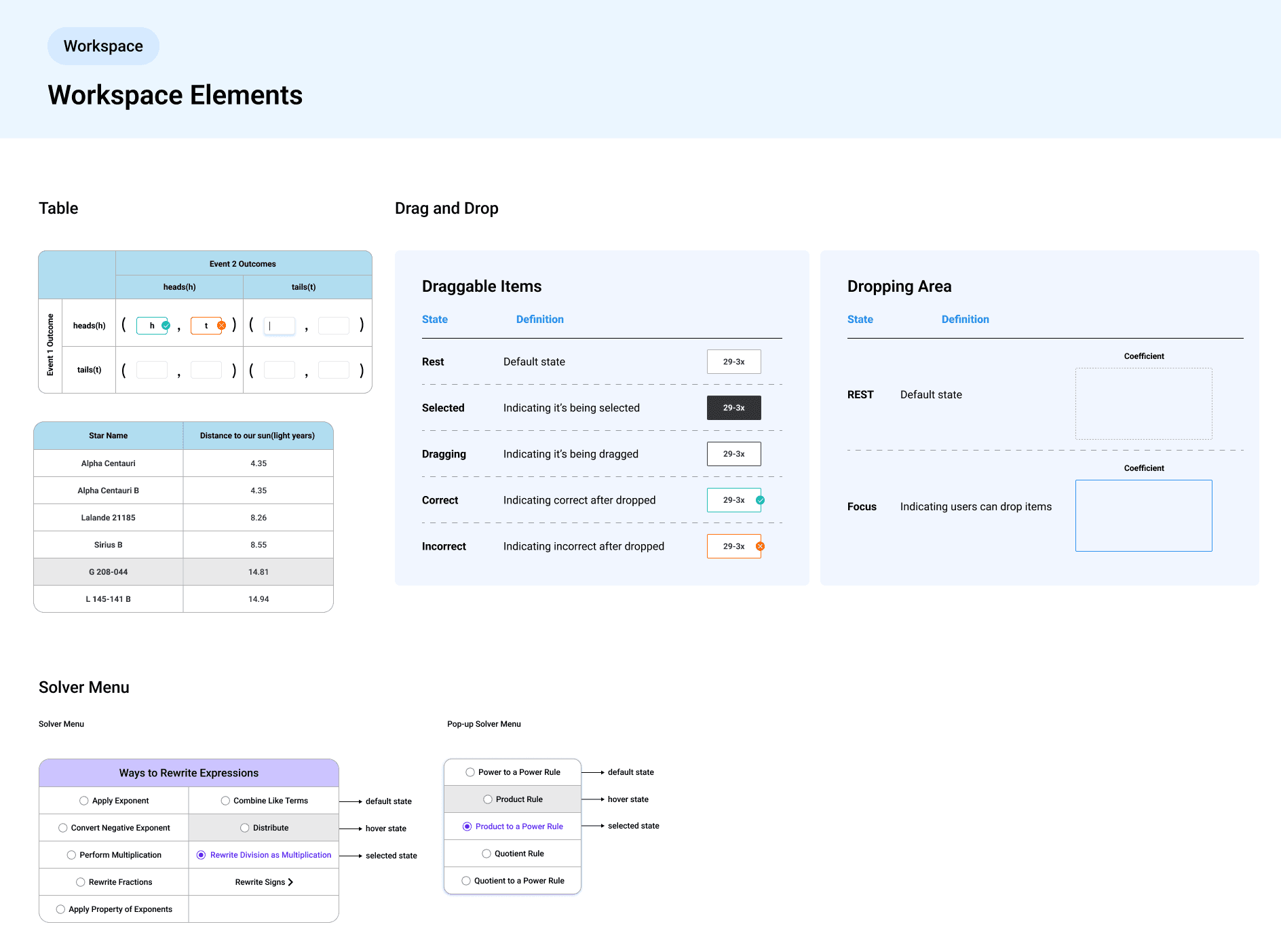
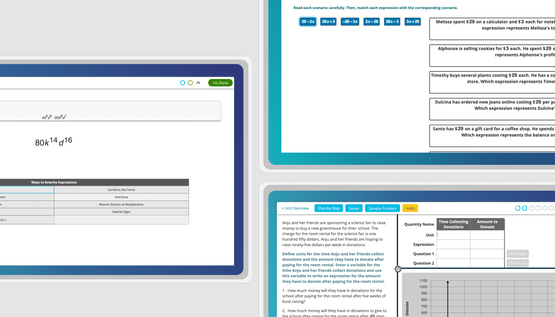
Workspace Elements
💡 Challenge: Tables were central to the workspace, but lacked consistent behavior across use cases. Sort tools didn’t provide clear feedback.
✅ Decision: Audited table states (selected, focused, empty, with background), created scalable, reusable components, and refined sort tool feedback for task clarity.
🎯 Why it matters: Strengthened visual clarity and interaction consistency across different learning tasks, accommodating diverse problem types.

Hint User Flow
💡 Challenge: Hint usage was low—students felt hints weren’t helpful or intuitive, and level 3 hints were locked behind a confusing pause.
✅ Decision: Redesigned the hint modal for greater clarity and simplicity. Replaced the forced pause with a message modal that prompted reflection before revealing the final hint.
🎯 Why it matters: Encouraged thoughtful usage of scaffolding hints and made support tools more approachable, improving learning motivation and UX flow.
Through multiple design iterations and weekly design reviews, I refined the UI to visually differentiate hint levels using both color and label. Purple buttons now indicate free hints (level 1 and 2), while yellow signals mastery-impacting level 3 hints. A tooltip was added to clarify each hint type, and a warning window was introduced before revealing the final hint. These changes made the experience more transparent and gave students better control over when and how to seek help.
Impact
👩🏫 For Users (Students):
Improved information hierarchy and UI clarity, leading to a more confident and focused problem-solving experience.
Enhanced visual accessibility (contrast, font sizing, spacing), reducing cognitive load and making instructions easier to follow.
Redesigned hint UI increased discoverability and usage—encouraging help-seeking behavior and deeper engagement.
📊 For PMs:
Delivered a scalable and prioritized redesign roadmap tailored to product goals and team bandwidth.
Provided clear visual documentation that addressed usability pain points without disrupting core functionality.
Highlighted UX opportunities beyond UI polish—especially around learning motivation and feature adoption.
💻 For Developers:
Created a structured, dev-friendly design spec including terminology alignment and annotated assets.
Enabled smoother handoff through style guidelines tied to actual component classes and CSS references.
Improved consistency across components, making future maintenance and scaling easier and faster.